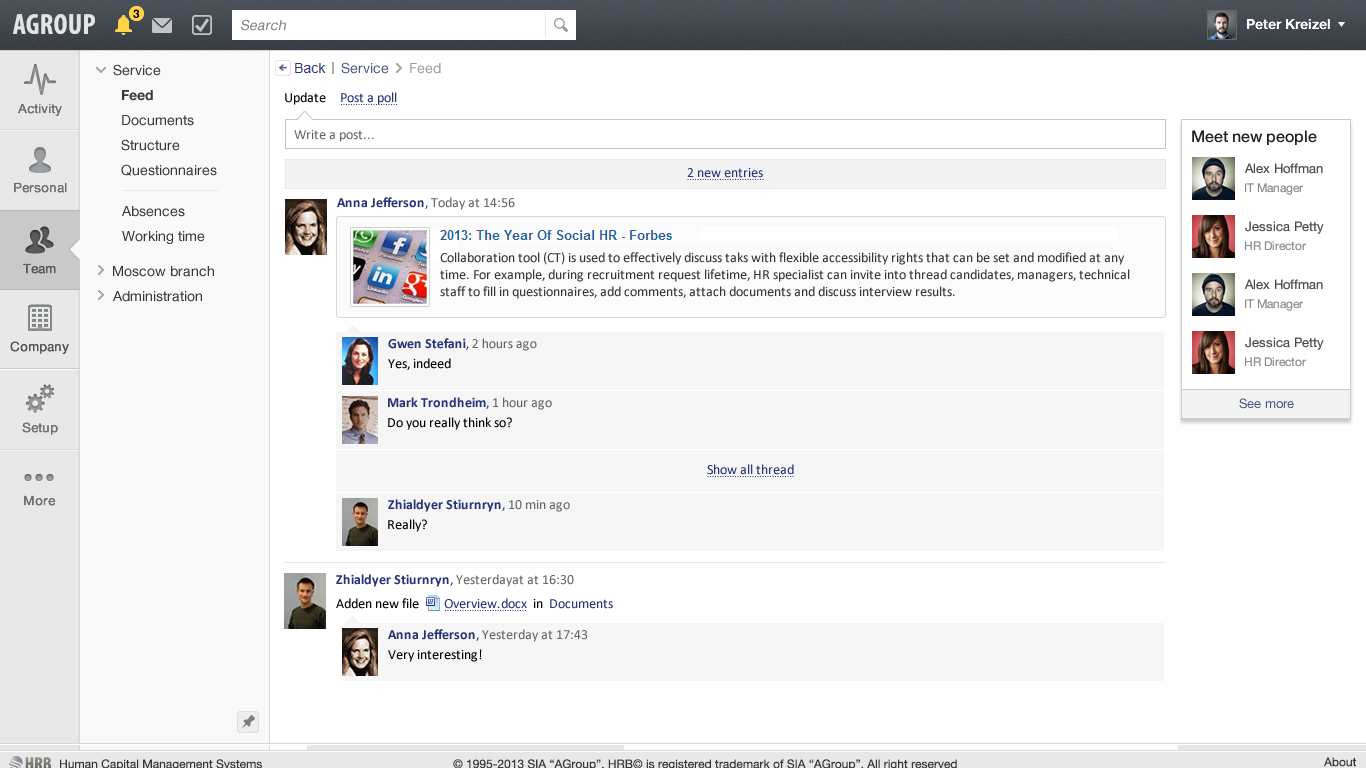
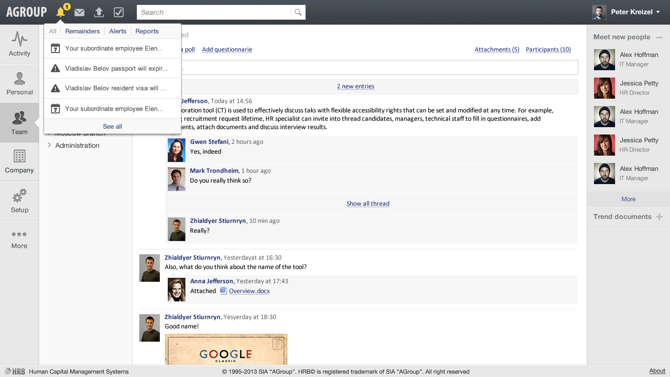
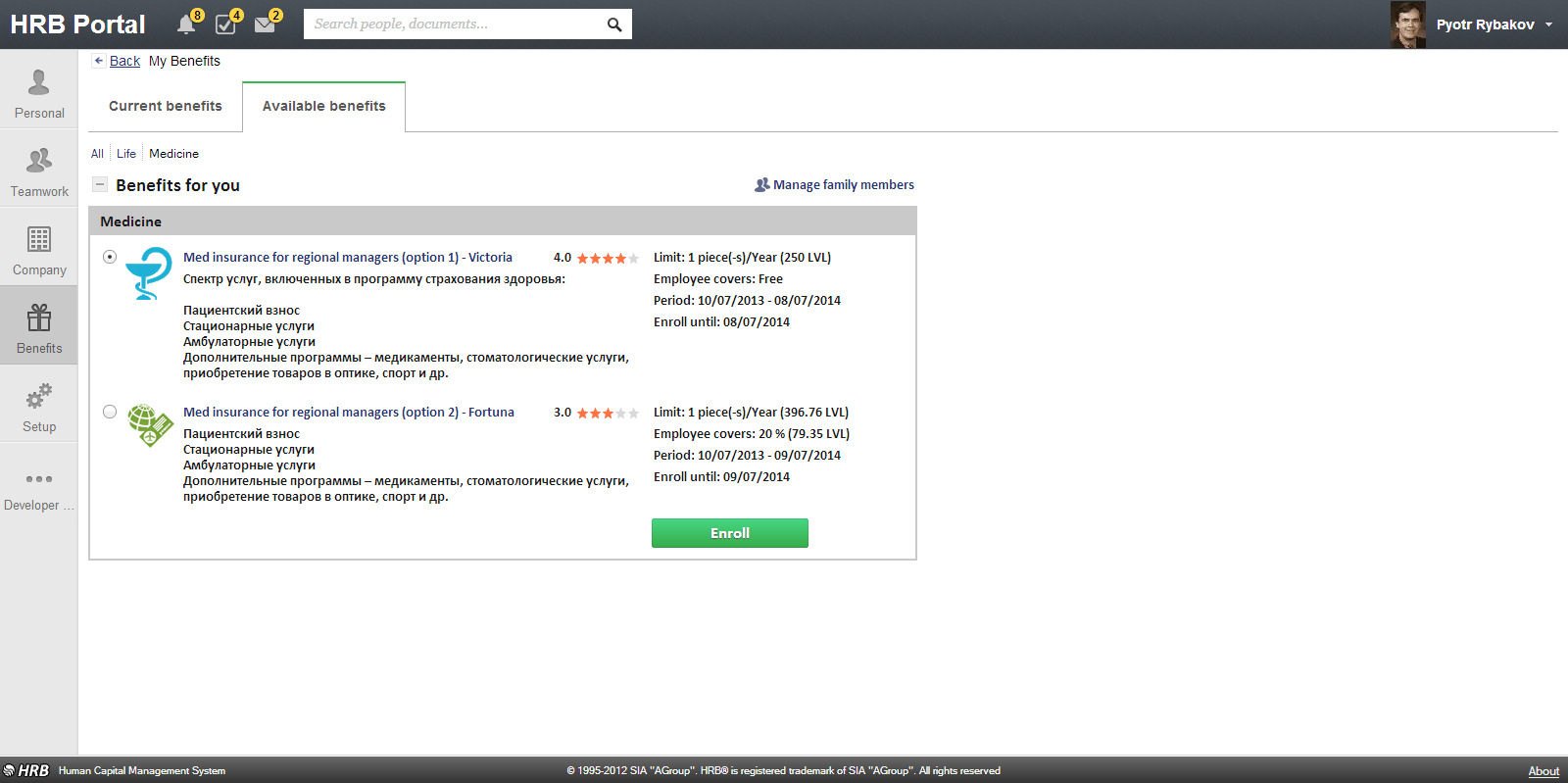
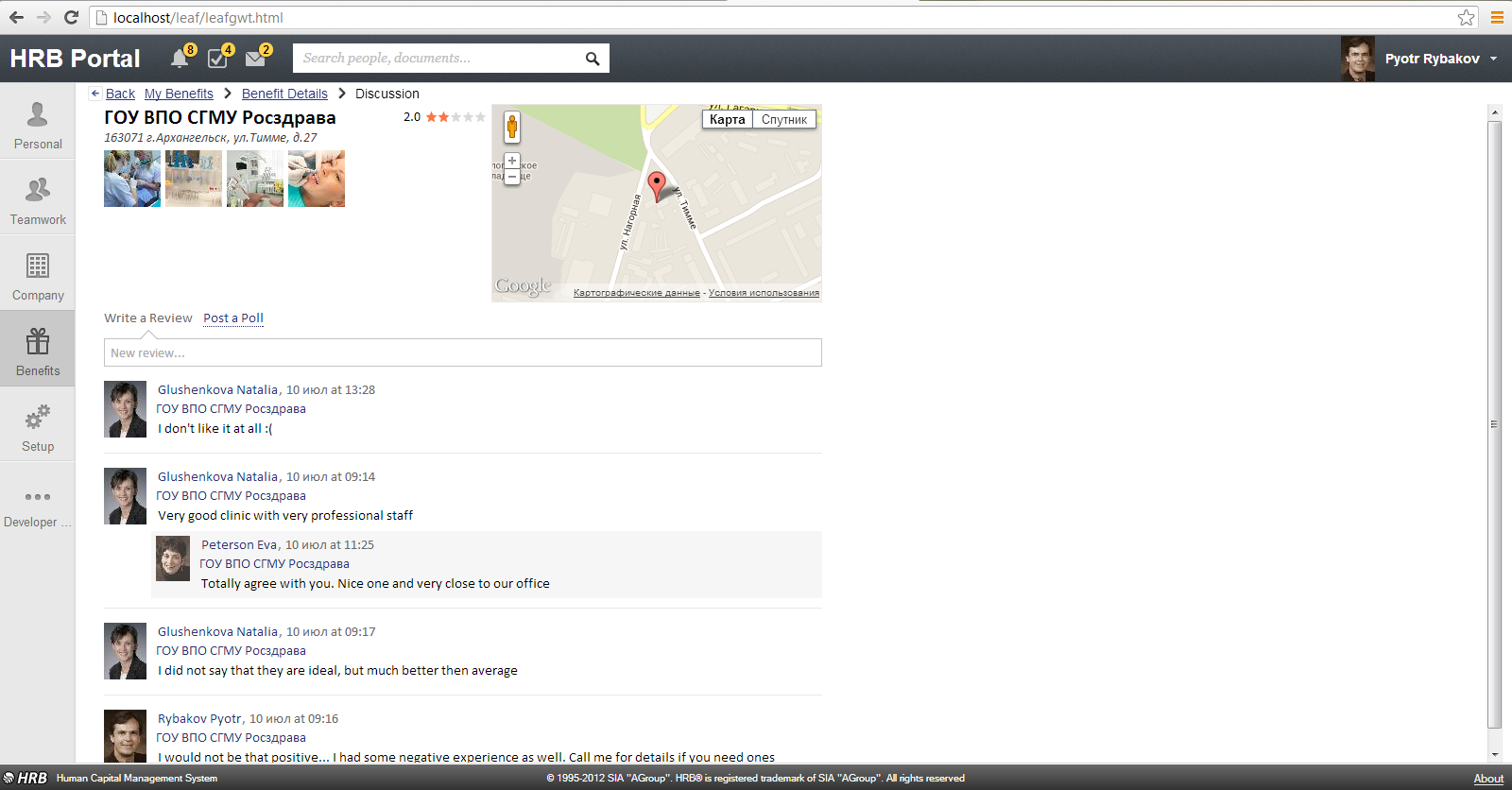
During the work on the new version of HRB Portal the user interface (UI) has been completely redesigned, by using the modern developments in Web technology and addressing the needs of the target audience of the product.
Redesigned navigation saves the user from having to make unnecessary “clicks” and reduces the total time to search information in the portal, and a specially designed menu saves space on a page and allows the user to focus directly on solving the challenges ahead.
In the design of the new UI the “minimal” design (flatdesign) approach was used: minimal graphics and focus on the content eliminates the distraction of the user and makes interaction with the portal most convenient.
An important part of improving the efficiency of business processes in the modern company is their socialization. Within the framework of the new UI of HRB Portal this task is solved by one of the new features – activity feed. It shapes a uniform information environment for the users of the portal, provides an opportunity to share the latest news, and get information on different topics and documents, as well as organise discussions in the process of carrying out certain tasks and projects.


